top of page


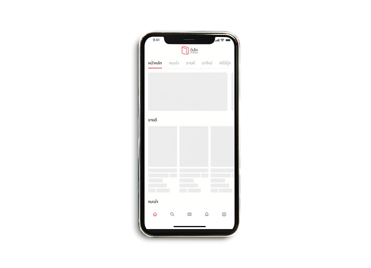
Pinto e-book by Fictionlog is a unique and innovative concept that brings the warmth of a physical bookstore to the digital world. It offers a full and immersive experience for writers and readers to buy, sell, and read e-books in a friendly and welcoming atmosphere. With a wide range of genres to choose from, including novels, comics, and general books
Team Project :
Chayanit Chutigraiwun ( UX Designer ) , Kanitta srisawat ( UI Designer ) , Pawanpat Siriphongnithi ( UI Designer )
Colors (Light Mode)
Colour usage inside the platform includes brand colours and colours with their function. Each brand colour contains fill colour, with various colour densities that apply to different use cases, from the hierarchy of information to the device's Dark Mode. It is essential that our use of color be consistent across all applications. By referring to these guidelines, we will achieve the desired results for our brand, and we'll work more efficiently by eliminating guesswork.
Light/Red-01-
Primary
#e84342
rgb(232, 67, 66)
Light/Red-02-
Darker
#dd3e3d
rgb(221, 62, 61)
Light/Red-03-
Lighter
#fa6b6a
rgb(250, 107, 106)
Light/Red-04-
Lightest
#ffbcbc
rgb(255, 188, 188)
Light/Red-05-
Primary
#ffeaea
rgb(255, 234, 234)
Light/Red-06-Secondary
#fff4f4
rgb(255, 244, 244)
Light/Red-07-Tertiary
#fffafa
rgb(255, 250, 250)
Light/ WarmBlack-01- Label-Primary
#2d292a
rgb(45, 41, 42)
Light/ WarmBlack-02- Label-Secondary
#6e6e6e
rgb(110, 110, 110)
Light/ WarmBlack-03- Label-Tertiary
#acacac
rgb(172, 172, 172)
Light/ WarmBlack-04- Label-Quaternary
#dcdcdd
rgb(220, 220, 221)
Light/ WarmBlack-05- Fill Primary
#eaeaea
rgb(235, 235, 235)
Light/ WarmBlack-06- Fill-Secondary
#f5f5f5
rgb(245, 245, 245)
Light/ WarmBlack-07- Fill-Tertiary
#f8f8f8
rgb(248, 248, 248)
Light/Paper-01- Primary
#fff8e6
rgb(255, 248, 230)
Light/Paper-02- Darker
#fad063
rgb(250, 208, 99)
Light/Paper-03- Lighter
#fff4d6
rgb(255, 244, 214)
Light/Paper-04- Lightest
#fff6e0
rgb(255, 246, 224)
Light/Paper-05- Fill-Primary
#fffaeb
rgb(255, 250, 235)
Light/Paper-06- Fill-Secondary
#fffbef
rgb(255, 251, 239)
Light/Paper-07- Fill-Tertiary
#fffdf5
rgb(255, 253, 245)
Light/
Blueprint-01- Primary
#37b0cc
rgb(255, 248, 230)
Light/
Blueprint-02- Darker
#249eba
rgb(250, 208, 99)
Light/
Blueprint-03- Lighter
#4cc3de
rgb(255, 244, 214)
Light/
Blueprint-04- Lightest
#86def0
rgb(255, 246, 224)
Light/
Blueprint-05-Fill- Primary
#c9f4fd
rgb(255, 250, 235)
Light/
Blueprint-06-Fill- Secondary
#dbf7fd
rgb(255, 251, 239)
Light/
Blueprint-07-Fill- Tertiary
#effcff
rgb(255, 253, 245)
Colors (Dark Mode)
Dark/Red-01- Primary
#e84342
rgb(232, 67, 66)
Dark/Red-02- Darker
#b41817
rgb(180, 24, 23)
Dark/Red-03- Lighter
#742424
rgb(116, 36, 36)
Dark/Red-04- Lightest
#5d1e1e
rgb(93, 30, 30)
Dark/Red-05-Fill- Primary
#220404
rgb(34, 4, 4)
Dark/Red-06-Fill- Secondary
#1f0000
rgb(31, 0, 0)
Dark/Red-07-Fill- Tertiary
#120000
rgb(18, 0, 0)
Dark/ WarmBlack-01- Label-Primary
#fdfdfd
rgb(253, 253, 253)
Dark/ WarmBlack-02- Label-Secondary
#adadad
rgb(173, 173, 173)
Dark/ WarmBlack-03- Label-Tertiary
#8e8e8e
rgb(142, 142, 142)
Dark/ WarmBlack-04- Label-Quaternary
#444445
rgb(68, 68, 69)
Dark/ WarmBlack-05- Fill Primary
#2f2f2f
rgb(47, 47, 47)
Dark/ WarmBlack-06- Fill-Secondary
#1c1d21
rgb(28, 29, 33)
Dark/ WarmBlack-07- Fill-Tertiary
#151517
rgb(21, 21, 23)
Dark/Paper-01- Primary
#453300
rgb(69, 51, 0)
Dark/Paper-02- Darker
#805f00
rgb(128, 95, 0)
Dark/Paper-03- Lighter
#5c5031
rgb(92, 80, 49)
Dark/Paper-04- Lightest
#4b3f1c
rgb(75, 63, 28)
Dark/Paper-05- Fill-Primary
#3e3312
rgb(62, 51, 18)
Dark/Paper-06- Fill-Secondary
#2e2408
rgb(46, 36, 8)
Dark/Paper-07- Fill-Tertiary
#211902
rgb(33, 25, 2)
Dark/
Blueprint-01- Primary
#37c0e0
rgb(55, 192, 224)
Dark/
Blueprint-02- Darker
#37d6fa
rgb(55, 214, 250)
Dark/
Blueprint-03- Lighter
#337888
rgb(51, 120, 136)
Dark/
Blueprint-04- Lightest
#255864
rgb(37, 88, 100)
Dark/
Blueprint-05-Fill- Primary
#1c4a55
rgb(28, 74, 85)
Dark/
Blueprint-06-Fill- Secondary
#0f3a45
rgb(15, 58, 69)
Dark/
Blueprint-07-Fill- Tertiary
#012933
rgb(1, 41, 51)
Icons
Icons should use to emphasize the message and reduce cognitive load when you need to call attention to a particular action. We create a recognizable, highly simplified design while maintaining visual consistency across all interface icons in our platform. This cluster of icons is represented the brand personality and offers playfulness but still functions.
Navigation
Option
Editor
Action

Sizes

Icon size
-
width: 24px, height: 24px
Typography
We use Opun, in three different weight, for both product and marketing. This character helps emphasize content with a soft and friendly approach but still offer legibility.
Opun
Style
Weight
Size
LargeTitle
SemiBold
34
Title1
SemiBold
28
Title2
SemiBold
24
Title3
SemiBold
22
Headline
SemiBold
20
Body
SemiBold
18
Callout
SemiBold
16
Subheadline
SemiBold
14
Footnote
SemiBold
12
Caption1
SemiBold
10
Buttons
Buttons are clickable elements that are used to trigger actions. They communicate calls to action to the audience and allow users to interact with pages in various ways. Button labels express what action will occur when the user interacts with it.Each button variant has a particular function, and its design signals that function to the user. Therefore, each variant must be implemented consistently across products so that they define the most accurate actions.
Solid Button (Primary)
Default
Hover
Pressed
Disable
On/Off Stages
Default
Hover
Pressed
Disable
Specs

Spacing
-
Left,Right 24x24 px
-
Top,bottom 4x4 px
Size
-
width: Hug, height: 40px
Outline Button (Secondary)
Default
Hover
Pressed
Disable
Specs

Spacing
-
Left,Right 24x24 px
-
Top,bottom 4x4 px
Size
-
width: Hug, height: 40px
Usages


Modal
Modal is a user interface design pattern that presents content in a pop-up window, which requires users to interact with it before returning to the main interface. It is an effective way to grab users' attention and focus on important information or actions.
Modal
Shadow
-
S1: S1: Shadow (X:0 Y:10 Blur:50 Spread: #000000 20%)

Shadow
-
S1: S1: Shadow (X:0 Y:10 Blur:50 Spread: #000000 20%)

Shadow
-
S1: S1: Shadow (X:0 Y:10 Blur:50 Spread: #000000 20%)


bottom of page