top of page

Fictionlog
Fictionlog is an all-in-one online fiction archive and e-book store where you can read, write, and sell your own books. With over 50,000 books to choose from, including free novels, cartoons, and popular titles, Fictionlog has something for everyone. Aspiring writers can easily create and sell their own work, and receive a fair share of revenue and full copyright ownership. With a user-friendly interface and features like filtering systems, eye-saving mode, and the ability to pick up where you left off, Fictionlog offers a convenient and enjoyable reading experience. Purchase books easily through the gold coin system and discover quality content and valuable promotions from publishers.
Team Project : Wanitcha Sanitchon ( UI Designer ) , Pawanpat Siriphongnithi ( UI Designer ) , Nattanan Sreeumnoychai ( UX Designer )
Colors (Light Mode)
Colour usage inside the platform includes brand colours and colours with their function. Each brand colour contains fill colour, with various colour densities that apply to different use cases, from the hierarchy of information to the device's Dark Mode. It is essential that our use of color be consistent across all applications. By referring to these guidelines, we will achieve the desired results for our brand, and we'll work more efficiently by eliminating guesswork.
Light/Orange-01 Primary
#ffb900
rgb(255, 185, 0)
Light/Orange-02 Darker
#e6a700
rgb(230, 167, 0)
Light/Orange-03 Lighter
#ffc733
rgb(255, 199, 51)
Light/Orange-04 Lightest
#ffdc81
rgb(255, 220, 129)
Light/Orange-05 Fill Primary
#fff1cc
rgb(255, 241, 204)
Light/Orange-06 Fill Secondary
#fff4d6
rgb(255, 244, 214)
Light/Orange-07 Fill Tertiary
#fff6e0
rgb(255, 246, 224)
Light/Red-01 Primary
#ff5a65
rgb(45, 41, 42)
Light/Red-02 Darker
#ff414d
rgb(110, 110, 110)
Light/Red-03 Lighter
#ff8d95
rgb(172, 172, 172)
Light/Red-04 Lightest
#ffc0c4
rgb(220, 220, 221)
Light/Red-05
Fill Primary
#ffdee0
rgb(235, 235, 235)
Light/Red-06
Fill Secondary
#ffe4e6
rgb(245, 245, 245)
Light/Red-07
Fill Tertiary
#ffebec
rgb(248, 248, 248)
Light/Turquois-01 Primary
#3bc6c6
rgb(59, 198, 198)
Light/Turquois-02 Darker
#34b3b3
rgb(52, 179, 179)
Light/Turquois-03 Lighter
#63d1d1
rgb(99, 209, 209)
Light/Turquois-04 Lightest
#8adddd
rgb(138, 221, 221)
Light/Turquois-05 Fill Primary
#d8f4f4
rgb(216, 244, 244)
Light/Turquois-06 Fill Secondary
#dff6f6
rgb(223, 246, 246)
Light/ Turquois-07 Fill Tertiary
#e7f8f8
rgb(231, 248, 248)
Light/Grays-01 Label Primary
#010000
rgb(1, 0, 0)
Light/Grays-02 Label Secondary
#757575
rgb(117, 117, 117)
Light/Grays-03 Label Tertiary
#bebec0
rgb(190, 190, 192)
Light/Grays-04 Label Quatenary
#dcdcdd
rgb(220, 220, 221)
Light/Grays-05 Fill Primary
#e4e4e6
rgb(228, 228, 230)
Light/Grays-06 Fill Secondary
#e9e9ea
rgb(233, 233, 234)
Light/Grays-07 Fill Tertiary
#eeeeef
rgb(238, 238, 239)
Colors (Dark Mode)
Dark/Orange-01 Primary
#f6b60e
rgb(246, 182, 14)
Dark/Orange-02 Darker
#f8c53f
rgb(248, 197, 63)
Dark/Orange-03 Lighter
#c99408
rgb(201, 148, 8)
Dark/Orange-04 Lightest
#987006
rgb(152, 112, 6)
Dark/Orange-05 Fill Primary
#59420e
rgb(89, 66, 14)
Dark/ Orange-06 Fill Secondary
#4a370e
rgb(74, 55, 14)
Dark/ Orange-07 Fill Tertiary
#3b2c0e
rgb(59, 44, 14)
Dark/Red-01 Primary
#ec5660
rgb(236, 86, 96)
Dark/Red-02 Darker
#cf5d68
rgb(207, 93, 104)
Dark/Red-03 Lighter
#8d3343
rgb(141, 51, 67)
Dark/Red-04 Lightest
#682531
rgb(104, 37, 49)
Dark/Red-05
Fill Primary
#551f2c
rgb(85, 31, 44)
Dark/Red-06
Fill Secondary
#471a27
rgb(71, 26, 39)
Dark/Red-07
Fill Tertiary
#391522
rgb(57, 21, 34)
Dark/Turquois-01 Primary
#2ebdbd
rgb(46, 189, 189)
Dark/Turquois-02 Darker
#4bd3d3
rgb(75, 211, 211)
Dark/Turquois-03 Lighter
#249494
rgb(36, 148, 148)
Dark/Turquois-04 Lightest
#1a6b6b
rgb(26, 107, 107)
Dark/Turquois-05 Fill Primary
#11444d
rgb(17, 68, 77)
Dark/Turquois-06 Fill Secondary
#0e3943
rgb(14, 57, 67)
Dark/Turquois-07 Fill Tertiary
#0b2d38
rgb(11, 45, 56)
Dark/Grays-01 Label Primary
#fffffe
rgb(255, 255, 254)
Dark/Grays-02 Label Secondary
#a2a2a2
rgb(162, 162, 162)
Dark/Grays-03 Label Tertiary
#5a5a5e
rgb(90, 90, 94)
Dark/Grays-04 label quatenary
#404044
rgb(64, 64, 68)
Dark/Grays-05 Fill Primary
#37373a
rgb(55, 55, 58)
Dark/Grays-06 Fill Secondary
#323235
rgb(50, 50, 53)
Dark/Grays-07 Fill Tertiary
#2b2b2f
rgb(43, 43, 47)
Icons
Icons should use to emphasize the message and reduce cognitive load when you need to call attention to a particular action. We create a recognizable, highly simplified design while maintaining visual consistency across all interface icons in our platform. This cluster of icons is represented the brand personality and offers playfulness but still functions.
Navigation
Option
Editor
Action

Figurative
Sizes

Icon size
-
width: 24px, height: 24px
Typography
We use DB Heavent, mostly bold, for both product and marketing. This character helps emphasize content with a modern twist but still offer legibility. You may see DB Heavent in medium occasionally to reduce the thickness of the overall screen.
DB HEAVENT
Style
Weight
Size
LargeTitle
Bold
34
Title1
Bold
28
Title2
Bold
22
Title3
Bold
20
Headline
Bold
17
Body
Bold
17
Callout
Bold
16
Subheadline
Bold
15
Footnote
Bold
13
Caption1
Bold
11
Buttons
Buttons are clickable elements that are used to trigger actions. They communicate calls to action to the audience and allow users to interact with pages in various ways. Button labels express what action will occur when the user interacts with it.Each button variant has a particular function, and its design signals that function to the user. Therefore, each variant must be implemented consistently across products so that they define the most accurate actions.
Primary Button (Orange)
Default
Hover
Pressed
Disable
Primary button (orange) with icon
Default
Hover
Pressed
Disable
Specs

Spacing
-
Left,Right 16x16 px
-
Top,bottom 6x6 px
-
Padding 16 px
Size
-
Width: Hug, Height: 40px

Spacing
-
Left, Right 16x16 px
-
Top, bottom 6x6 px
-
Between with icon 8 px Padding 16 px
Size
-
Width: Hug, Height: 40px
Secondary Button
Default
Hover
Pressed
Disable
Secondary button with icon
Default
Hover
Pressed
Disable
Specs

Spacing
-
Left,Right 16x16 px
-
Top,bottom 6x6 px
-
Padding 16 px
Size
-
width: Hug, height: 40px

Spacing
-
Left,Right 16x16 px
-
Top,bottom 6x6 px
-
Between with icon 8 px
-
Padding 16 px
Size
-
width: Hug, height: 40px
Usages

Modal
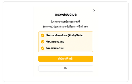
Modal is a user interface design pattern that presents content in a pop-up window, which requires users to interact with it before returning to the main interface. It is an effective way to grab users' attention and focus on important information or actions.
Modal
Spec
-
S1: S1: Shadow (X:0 Y:10 Blur:50 Spread: #000000 20%)
-
border-radius: 6px

Spec
-
S1: S1: Shadow (X:0 Y:10 Blur:50 Spread: #000000 20%)
-
border-radius: 6px


bottom of page