


What is Lazada?
Lazada is an international online shopping platform that connects shoppers, global brands, and sellers in one place. It helps people discover products easily, enjoy great deals, and shop conveniently anytime and anywhere through a simple and user-friendly experience.
Then, what is my role on the team?
My Role & Experience
-
Worked across 3 teams—Payment Domain, Content & Growth, and Campaign—in an international team with members from Singapore, China, Myanmar, Korea, Indonesia, and Vietnam, representing Thailand.
-
Designed and improved key fintech products including Lazada Wallet, Lazada PayLater, AliExpress PayLater, Lazada Insurance, LazLive, and major campaign experiences
-
My work focused on end-to-end UX improvements, UI components, motion and 3D visuals, and UX research to enhance overall user experience.

So, Here is some of my work
Design system
Lazada Pay Domain - I contributed to the Lazada Pay Design System by designing and refining reusable UI components, patterns, and guidelines for payment-related experiences. My work helped ensure visual and interaction consistency across products, improved design efficiency for the team, and supported a smoother
LazPay Branded Products
Branded UI components for Lazada Pay products, designed with consistent sizing, color usage, and layout to ensure clear brand recognition and seamless integration across different payment touchpoints.


Payment option icon
Branded UI components for Lazada Pay products, designed with consistent sizing, color usage, and layout to ensure clear brand recognition and seamless integration across different payment touchpoints.


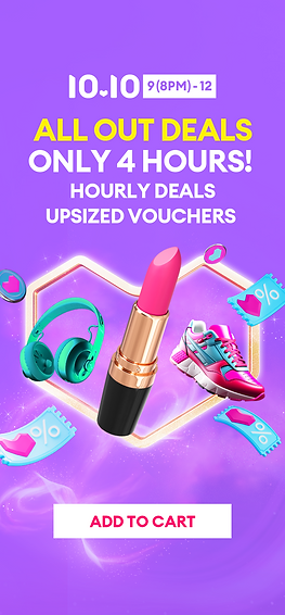
Campaign - Double Digit Campaign Assets
In this project, I helped create all the visual assets needed for the Double Digit Campaign. This included designing campaign visuals and supporting materials used across different platforms and country, while ensuring consistency with the brand and campaign direction.
Tab bar navigation icons
Before click

Mega

Teasing

Splash Screen
Lazzie
SKU

Mega Campaign Page Desktop Banner
Lazzie

SKU

Mega Campaign Page Mobile Banner
Lazzie

SKU

PDP Badges - Product detail page
Teasing
Mega

NEW HP JFY Sliding Banners - Vertical (App)
Lazzie


SKU


Then how should I share this with the local team?
I am responsible for creating the master Photoshop files, which serve as the foundation for the asset library. The library is then shared with local teams across different countries, allowing them to download and apply the assets consistently. All designs strictly follow the campaign guidelines to ensure brand consistency and alignment across all markets.


Can change here


Can change here
Animation Library for LazPay Domain
Built an animation library for the LazPay Domain to enhance user engagement and improve overall product experience.
The animations were designed to make interactions feel more intuitive, engaging, and easy to understand, especially within payment-related flows.
CTA animation
Incorporating animated CTAs on the onboarding page can capture user attention, make the call-to-action more compelling, and guide users more effectively through the onboarding process.
Increased Visibility and Attention:
-
Insight: Animated CTAs draw attention more effectively than static buttons. The movement or visual effects can make the CTA stand out, prompting users to take action.
-
Effect: Increased visibility can lead to higher click-through rates and improved user interaction with the CTA.
Enhanced User Guidance:
-
Insight: Animation can be used to guide users through the onboarding process by drawing their attention to key actions or next steps. This helps in making the process intuitive and straightforward.
-
Effect: Clearer guidance can reduce friction and confusion, leading to smoother navigation and higher conversion rates.
Emotional Impact:
-
Insight: Engaging animations can create a more dynamic and enjoyable user experience, making the onboarding process feel less monotonous and more engaging.
-
Effect: A more engaging experience can increase user motivation to complete the onboarding process.
Opt 1
-
Create animation tool tip with Lazzie to make a user attention on this button.
Opt 2
-
Place the Lazzie animation at the top of the button to make users feel more comfortable pressing the button
-
Also the color gradient continues to move to draw users' attention to the button
Opt 3
-
Make our primary button in to pulsating button
Opt 4
-
Using Hand Gesture animation in our Global animation to encourage users to click on this button
Opt 5
-
Using button shimmer stroke as animation in a white BG
Opt 6
-
Using button shimmer stroke as animation in a dark BG
Animate 2 businesses case : LazFin Journey Animations
Tile entrance:
-
PayLater + LazBon: 2 logos, vertically stacked top and bottom
-
[PL] 0% interest, more shopping less stress
-
[CL] More cash, any purpose!
-
Go back to tile: static, no animation, Top = PL, btm = CL
Clickthrough to LazFin pop-up :
-
Reverse 2 to end with 2 business logo
-
How to fly 2 businesses into each Asset Card, one by one to highlight sequentially.
-
[Condition] Other Biz like Wallet logo cannot be Animating concurrently
-
[Option] Overlay with countdown timer to autoclose (NU onboarding/education style)
Credit boost icon animation
PL Onboarding AB Testing
Design hypotheses to be tested
Clear CTA + Vertical Layout
-
A well-designed CTA button combined with a vertical layout that clearly highlights key benefits of the paylater service will increase user engagement and conversion rates by improving clarity and reducing cognitive load.
Usage of real image for benefits
-
Real images can help users relate more easily to the service. Seeing images of people who look like potential users, or scenarios that reflect common use cases, makes the benefits more tangible and believable.
-
Real images can evoke emotions and create a stronger connection with users. For instance, showing satisfied customers or real-life experiences can generate positive feelings and a sense of aspiration, encouraging users to envision themselves benefiting from the service.

Test results
-
ID🇮🇩/PH🇵🇭 : Option C , real person image performs the best
Why generally increase
Visual Appeal and Trust by using real person images :
-
The use of real person images in Version C may enhance the trustworthiness and relatability of the content, leading to a higher apply rate.
Layout and Flow :
-
Impact : The vertical layouts used across all groups are designed to guide the user through the key benefits and steps to apply. Group C’s layout, which combines real-person imagery with the benefits, appears slightly more effective.
-
UI Perspective : A clear vertical layout that shows information from the main benefits down to the application steps helps guide users smoothly.
By presenting the most attractive points first, users understand the value before seeing how to apply.
This top-to-bottom flow may explain why Group C has a slightly higher apply rate.
Result_ ID🇮🇩/PH🇵🇭

Test results
-
TH🇹🇭 : Option A , old layout version still performs the best
Why generally increase
Simplified information :
-
The Credit Limit and Benefits in Option A and the Online Version are clearer and more prominent compared to Option B/C, where the use of all blue tones distracts attention from the Credit Limit users would receive. This leads to higher apply rates for Option A and the Online Version.
Visual Theme/Style: :
-
TH statistics indicate a preference for softer color tones, which seems to enhance application rates.
Result_ TH🇹🇭
Conclusion
-
Higher apply rates in TH come from using soft color tones, clear structure, and precise content.
Recommendations for Future Development Based on Test 3 and User Insight
-
Real Person Images (PH/ID) & Illustration (TH) :
Continue using real person images to build trust in PH/ID, as they deliver positive results. For TH, apply illustrations to create a clean, stylish, and inviting visual aesthetic.
-
Vertical Layout (TH/PH/ID):
Maintain the effective vertical layout in Thailand while modernizing it, and continue to develop the vertical layout in PH/ID to improve user experience and make application steps clearer.
-
Animated CTA Buttons (TH/PH/ID):
Develop animated CTA buttons with standout colors to increase user engagement and click rates in all markets.
LazPay - User Flow
Lazada Paylater - Repayment Flow
Designed and optimized the repayment flow to guide users through checking their bills, selecting payment methods, and completing repayments. The goal was to make the process simple, transparent, and easy to complete, especially for users managing multiple installments.


